Warp Gradient
Warp Gradient
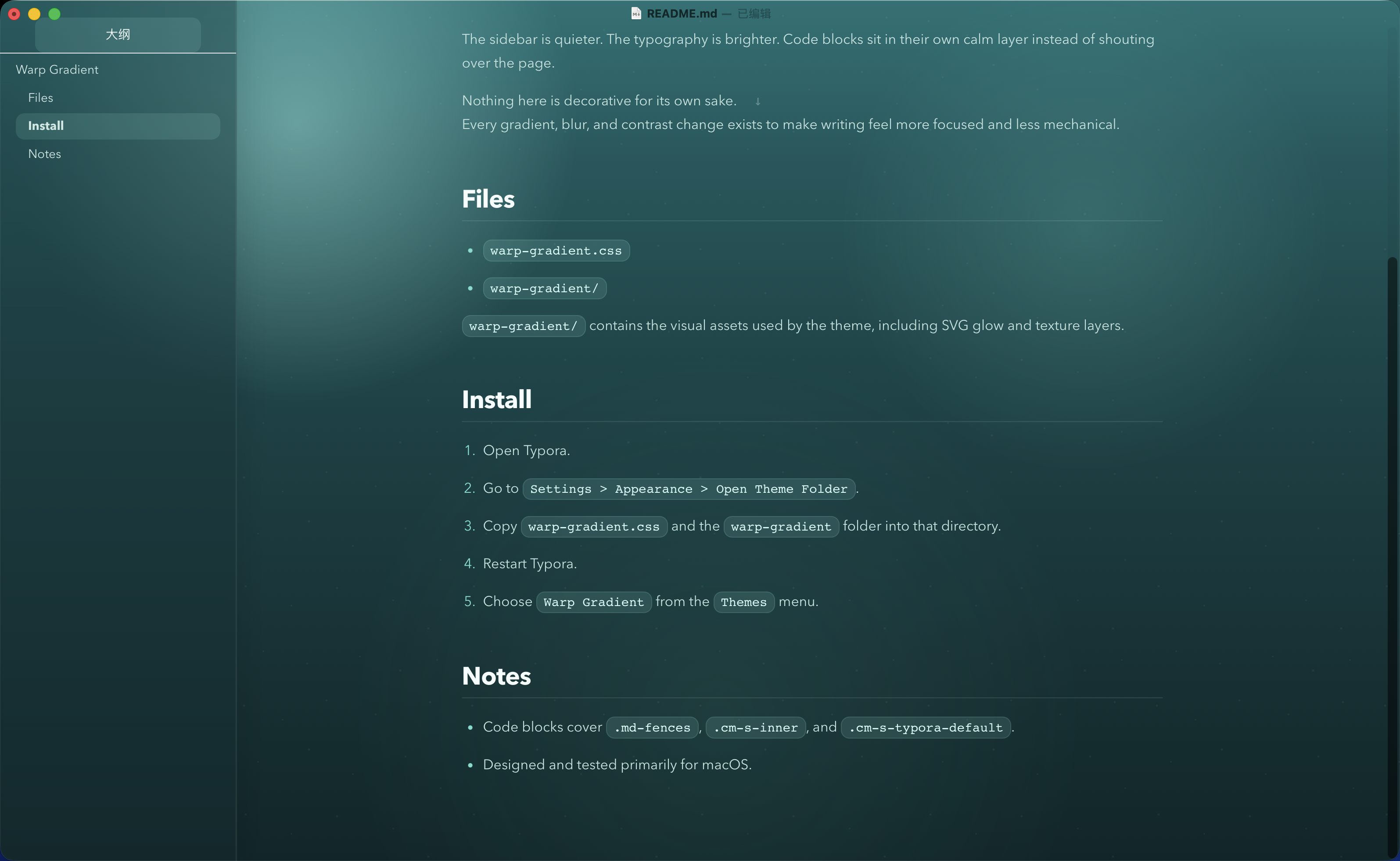
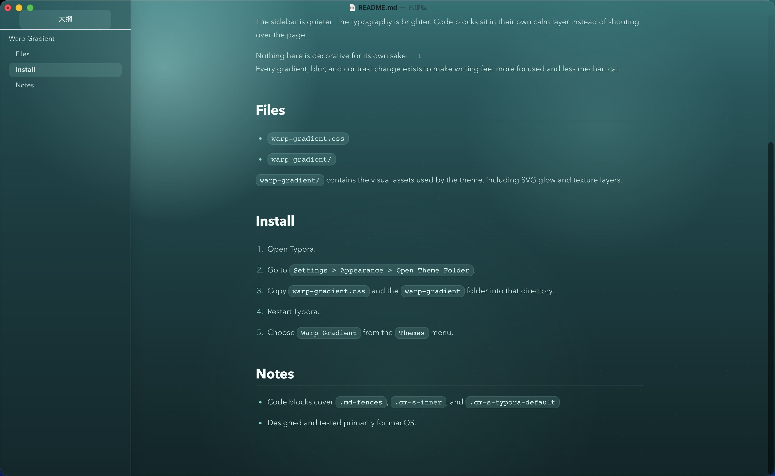
Warp Gradient 是一款为 Typora 设计的暗色主题,灵感来自 Warp 那种克制、冷静、带有青绿色渐变层次的界面气质。
它不是为了做成一张“设计感很强”的皮肤,而是为了让文档在长时间阅读和书写时更安静、更清楚、更少干扰。
设计目标
- 只保留一个主主题,不在浅色和深色之间摇摆。
- 用上浅下深的青绿色渐变建立稳定的空间感。
- 让正文、标题、代码块和侧边栏形成统一而不过度抢眼的层级。
- 让技术写作在 Typora 里看起来更完整,而不是只有正文区域被简单换色。
主题特点
1. Warp 风格的渐变氛围
主题背景从顶部较亮的淡绿色逐步过渡到底部更深的青蓝色,保留了明显的层次,但避免了过度饱和和过度发光。
这种处理让界面有气氛,但不会压过内容本身。
2. 更克制的侧边栏系统
相比很多 Typora 主题里高对比的白色侧栏,Warp Gradient 把侧边栏重新压回到整体色系中:
- 保留分区感
- 降低割裂感
- 保持可读性
- 让大纲、文件列表和正文处在同一个视觉系统里
3. 面向长文阅读的正文排版
这套主题重点控制了几个最容易失衡的地方:
- 标题与正文对比
- 中文正文亮度
- 强调文本识别度
- 列表与引用块节奏
- 大段技术说明文的连续可读性
它更适合长时间写作,而不是短时间展示。
4. 独立处理的代码区域
代码部分不是普通的反色块,而是单独做了更深的面板层:
- 行内代码更像轻量标签
- 代码块拥有独立背景与边界
- 语法高亮走低噪声、高辨识度路线
- 同时覆盖
.md-fences、.cm-s-inner和.cm-s-typora-default
这样在技术文档里,代码会更稳,也更像一个完整工具的一部分。
5. 资源目录与完整主题结构
这个项目不只有一个 CSS 文件,还包含了主题资源目录,用于承载背景纹理和视觉资源。
这样的结构更接近一个完整主题产品,而不是单次调色结果,也更方便后续继续扩展缩略图、字体或更多 UI 资源。
适用场景
这套主题尤其适合:
- 技术笔记
- AI 对话整理
- 编程学习记录
- 课程总结
- 带有大量代码块的 Markdown 文档
- 希望侧边栏和正文都保持统一气质的写作场景
如果你偏好极简纯白纸张感,它可能不是最合适的选择;但如果你希望文档更有空间氛围,同时仍然保持克制,它会更合适。
安装方式
- 打开 Typora。
- 进入
Preferences -> Appearance -> Open Theme Folder。 -
将以下内容复制到主题目录:
warp-gradient.csswarp-gradient/
- 重启 Typora。
- 在主题菜单中选择
Warp Gradient。
文件说明
-
warp-gradient.css:主题主文件 -
warp-gradient/:主题资源目录
总结
Warp Gradient 想做的不是“更花哨”,而是“更完整”。
它用更克制的渐变、更安静的侧边栏和更清楚的技术写作层级,把 Typora 调整成一个更适合长期使用的写作界面。
<a id="english-version"></a>
Warp Gradient
Warp Gradient is a dark Typora theme inspired by the restrained green-to-teal atmosphere of Warp.
It is not designed to be flashy. It is designed to make writing feel calmer, clearer, and more deliberate over long sessions.
Design Goals
- Keep a single primary theme instead of splitting the experience between light and dark.
- Build a stable sense of depth with a brighter green top and a deeper teal bottom.
- Create a coherent hierarchy across body text, headings, code blocks, and the sidebar.
- Treat the whole Typora interface as one product surface, not just recolor the editor area.
Highlights
1. A Warp-inspired gradient atmosphere
The background starts with a softer green glow near the top and gradually falls into a deeper teal. It keeps visual depth without becoming overly saturated or theatrical.
The result is atmospheric, but still restrained.
2. A quieter sidebar system
Instead of using a hard, high-contrast white sidebar, Warp Gradient pulls the sidebar back into the same visual family as the editor:
- clearer separation without harsh contrast
- less visual fragmentation
- better readability
- a more unified relationship between outline, file list, and content
3. Typography tuned for long-form reading
The theme pays special attention to the areas most likely to break reading rhythm:
- heading-to-body contrast
- body text brightness
- emphasis visibility
- list and blockquote pacing
- sustained readability in technical prose
It is designed more for long writing sessions than for momentary visual impact.
4. A dedicated code layer
Code is not treated as a simple inverted block. It lives on a deeper, separate layer:
- inline code behaves like a lightweight tag
- fenced blocks have their own background and edge definition
- syntax colors are readable without becoming noisy
- the theme covers
.md-fences,.cm-s-inner, and.cm-s-typora-default
This gives technical documents a more coherent and tool-like feel.
5. A complete theme structure
The project includes not only a CSS entry file, but also a resource folder for texture and visual assets.
That makes it closer to a complete theme product than a one-off recolor, and leaves room for future extension with thumbnails, fonts, or additional UI assets.
Best Use Cases
Warp Gradient works especially well for:
- technical notes
- AI conversation archives
- programming study notes
- course summaries
- Markdown documents with many code blocks
- writing workflows where the sidebar and editor should feel visually unified
If you prefer a pure white paper-like experience, this may not be the right theme. But if you want more spatial atmosphere without losing restraint, it is a strong fit.
Installation
- Open Typora.
- Go to
Preferences -> Appearance -> Open Theme Folder. -
Copy the following into the theme folder:
warp-gradient.csswarp-gradient/
- Restart Typora.
- Choose
Warp Gradientfrom the Theme menu.
Files
-
warp-gradient.css: main theme file -
warp-gradient/: theme asset folder
Summary
Warp Gradient is not trying to be louder. It is trying to be more complete.
With a restrained gradient, a quieter sidebar, and clearer hierarchy for technical writing, it turns Typora into a writing surface that feels more considered over time.
Repository: https://github.com/folook/typora_warp_gradient_theme
Download: https://github.com/folook/typora_warp_gradient_theme/archive/refs/heads/main.zip